Paint Color Psychology: How We Use Color Associations in Every Day Life

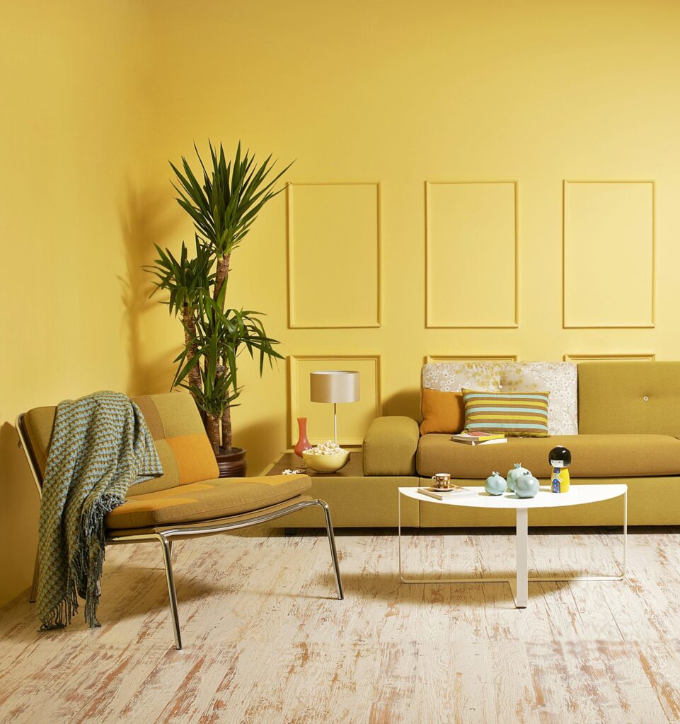
While perceptions of color vary from person to person, it has been speculated that there are universal psychological truths to color as well. By utilizing these concepts you can emit more positive vibes in your home, better understand the use of color in marketing and advertising, and perhaps even use home paint color selections as a holistic healing method.
It has been shown that warm paint colors like red, yellow, and orange evoke emotions ranging from contented happiness to anger and hostility. Opposite that, cool paint colors such as blue, green, and purple are often associated with feelings of calmness and sadness. Because of this phenomenon, paint color has long ago been tapped into by those in the marketing world. Researchers have found that up to 90% of snap judgement about products occur based on color alone! The graphic here seeks to give some examples of this:
Interestingly enough, color has been used by humankind since long before the Coca-Cola bottle was red. Some ancient cultures practiced color therapy to heal themselves with color. This treatment is still used in different ways today and is also referred to as chromotherapy or colorology. Some examples of using room color psychology with your house painting choices would be using the color red to stimulate the body and mind or to increase circulation, the color orange to increase energy levels, and blue to sooth illnesses and treat pain. Studies have also shown that warm-colored placebo pills were reported to be more effective than cool-colored ones, and that blue-colored street lamps reduce crime. Certain colors can even impact performance. For example, students who were exposed to the color red before a test were shown to have a worse performance than those who were not.
But how do color associations develop? It’s thought that culture and upbringing play a major role in the formation of these influences. We see some historical evidence when we think of the colors that go along with different holidays. Christmas-time green alludes to evergreen plants which remind us that winter doesn’t last forever, and the color red is said to represent the blood of Jesus or the apples from the paradise tree. For Halloween, the color orange is used because it is one of the most prevalent autumn colors and black for its associations with the after-life and darkness.
We also see some interesting associations with color and food. Red has been shown to strongly increase the appetite, hence many fast-food chains using the color to decorate their restaurants. Blue, on the other hand, is a color that humans are geared to avoid in foods because it typically indicates that they are poisonous or spoiled. Some weight loss plans even recommend eating your food off of a blue plate since it is the least appetizing.
Contact Nolan Painting today for a free color consultation regarding interior and exterior house painting services.

